
TEKINA — Street character, on screen
A photography template where bold typography and a disciplined structure give the images room to speak.
The challenge
A photographer’s website has two jobs: create a feeling and help people find what they need. Tekina brings the atmosphere of Japan’s streets into a site with services, work examples, and practical information. The design tension is between an expressive portfolio and a useful commercial template.
01 / Start with the frame
The supplied Figma hero contains an image placeholder. It exposes the underlying composition: a large headline, a brief introduction, one primary action, and a generous image area.
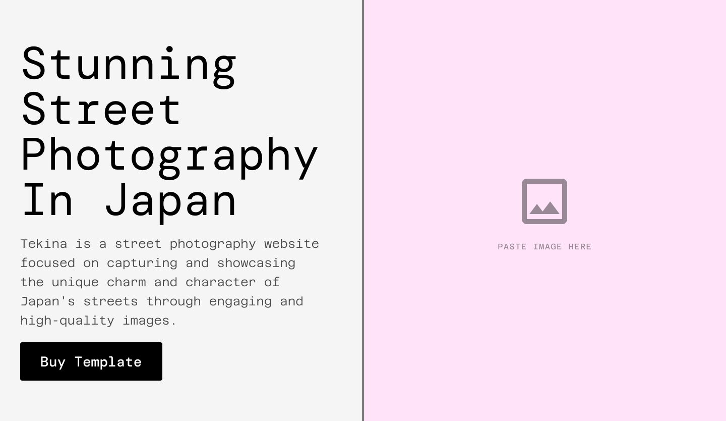
Structural study: actual Figma component with placeholder imagery, not a verified historical prototype.
The logic is to establish hierarchy before relying on a beautiful photograph. A split layout gives the message and image distinct space. Black type and sharp divisions keep that framework readable when the photography changes. This is especially useful for a template that will eventually hold someone else’s work.
02 / Turn character into a system
The component library reveals the work behind the visual personality: buttons with default and hover states, expandable FAQs, service cards, and navigation for desktop, tablet, and mobile.
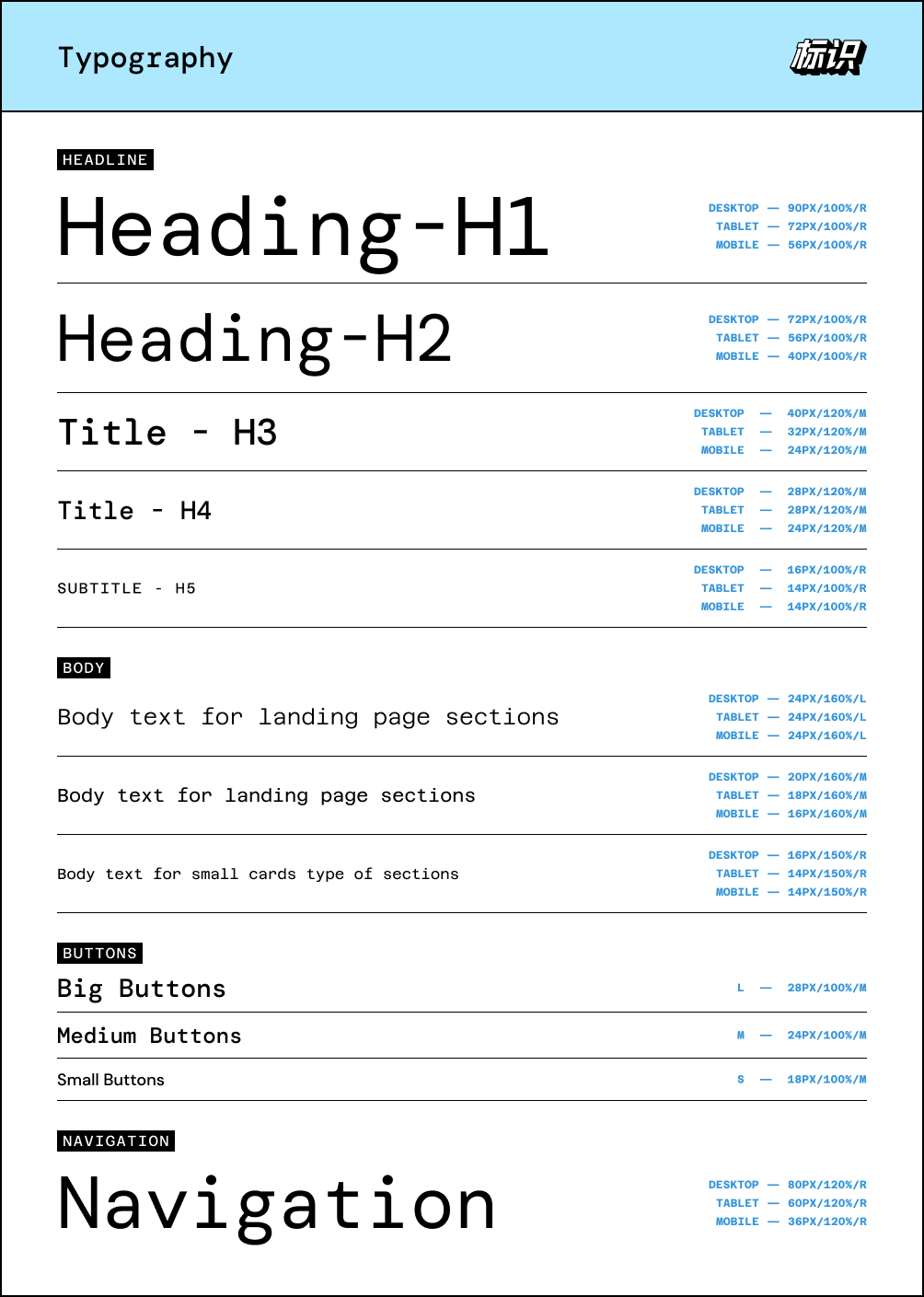
Typography — heading, body, button, and navigation styles from Figma.
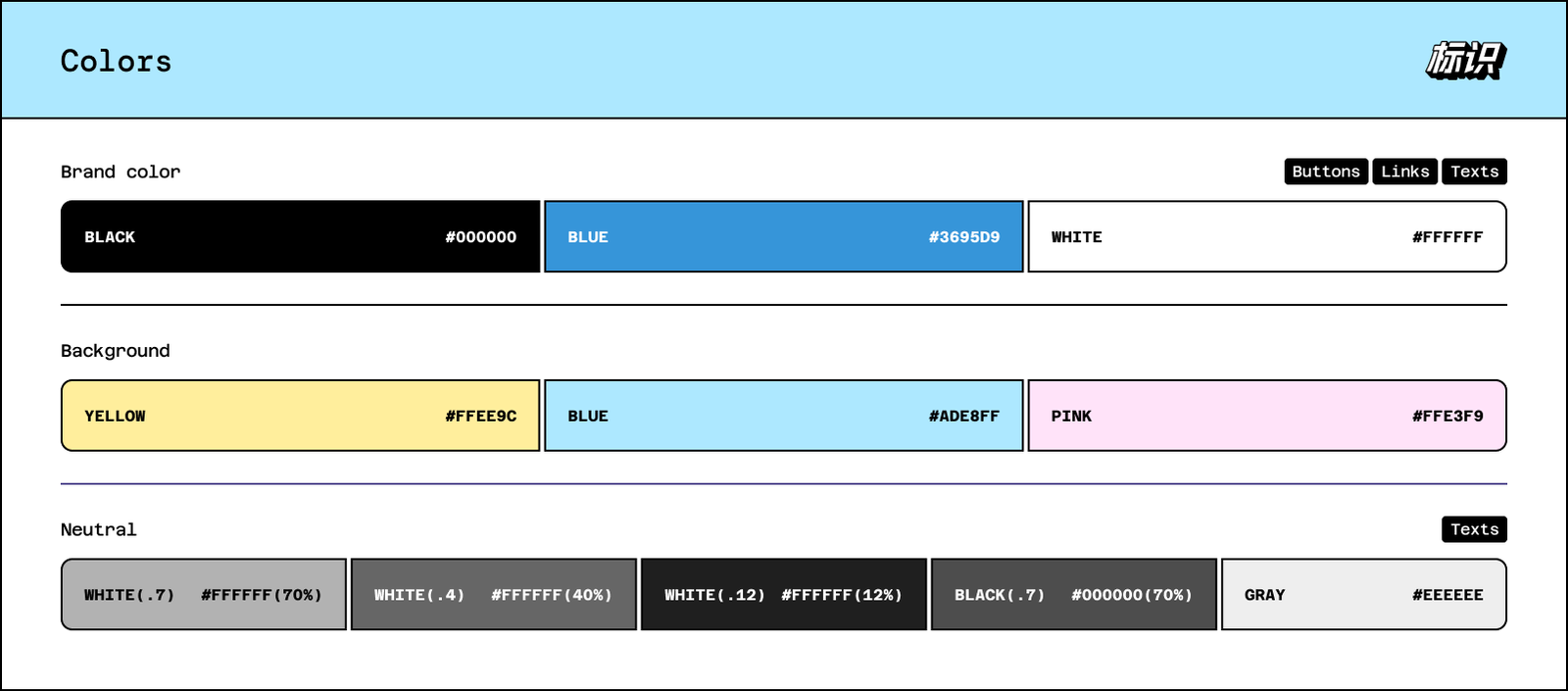
Colors — the palette documented in the Figma library.
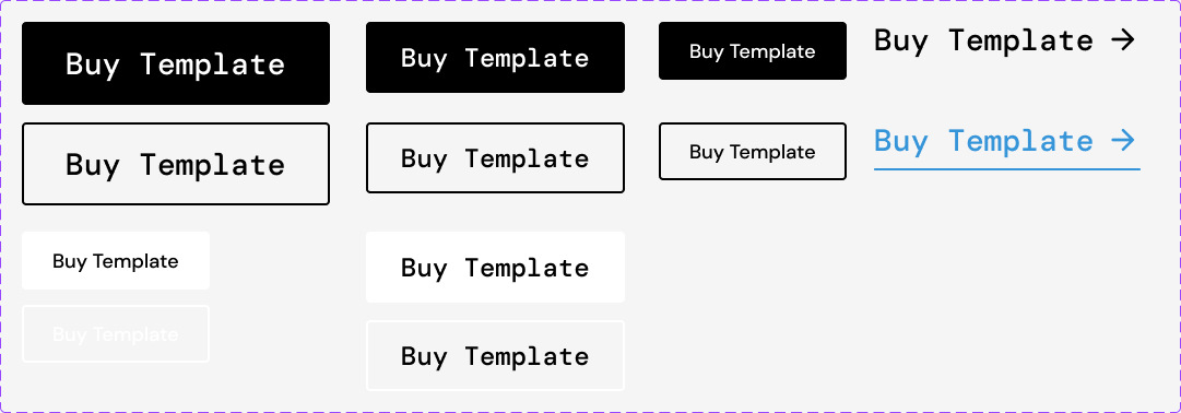
Buttons — sizes, black and white variants, text links, and default/hover states.
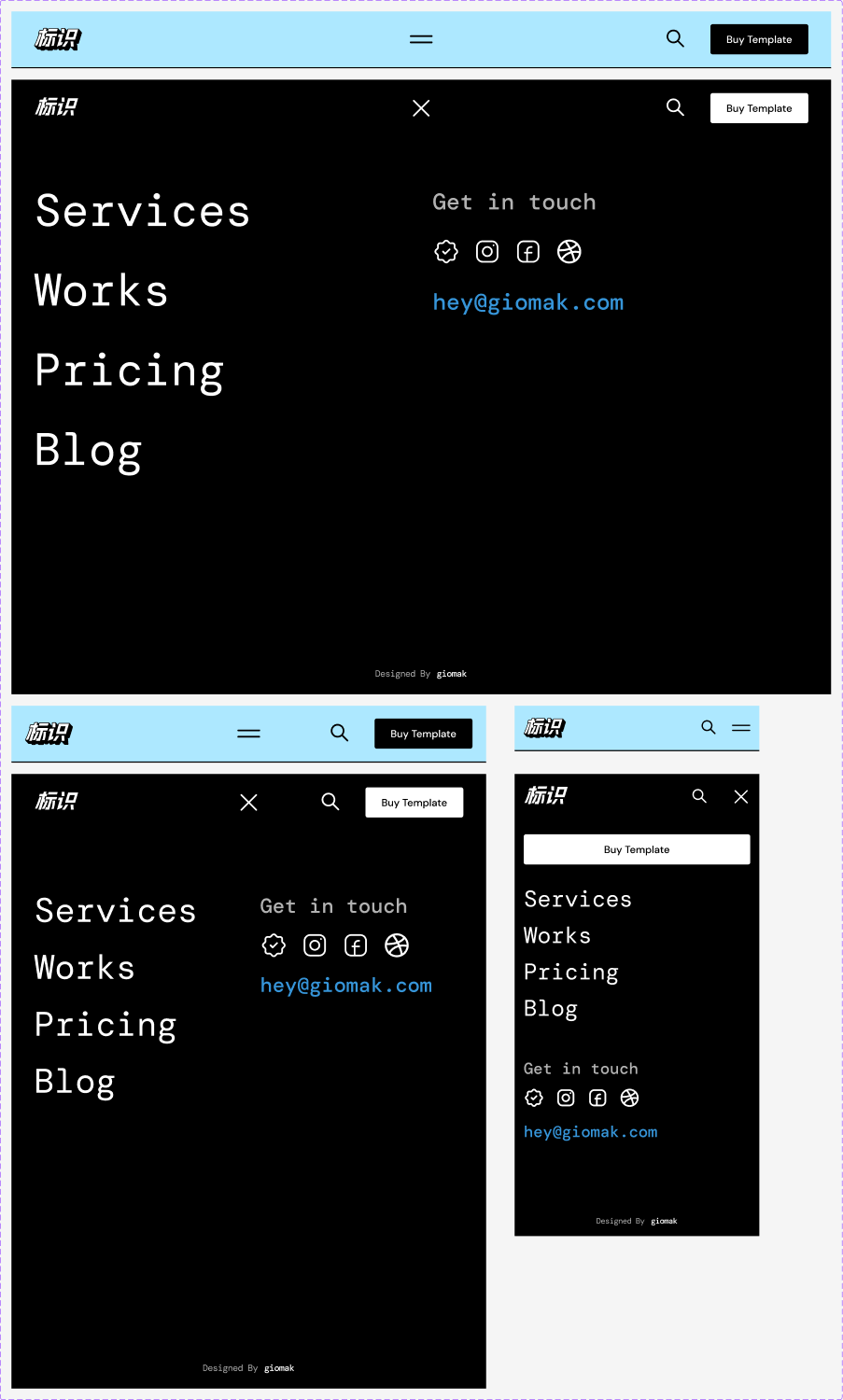
Development detail: closed and open navigation across three device layouts.
The closed menu stays compact; opening it reveals a high-contrast directory with large links. It is a convincing choice for an image-led site because navigation takes centre stage only when requested. On mobile, links and contact information stack vertically instead of squeezing the desktop arrangement into a smaller screen.
There is a trade-off: hidden links require an extra action. Clear, oversized labels in the expanded menu help visitors scan quickly.
More of the component system
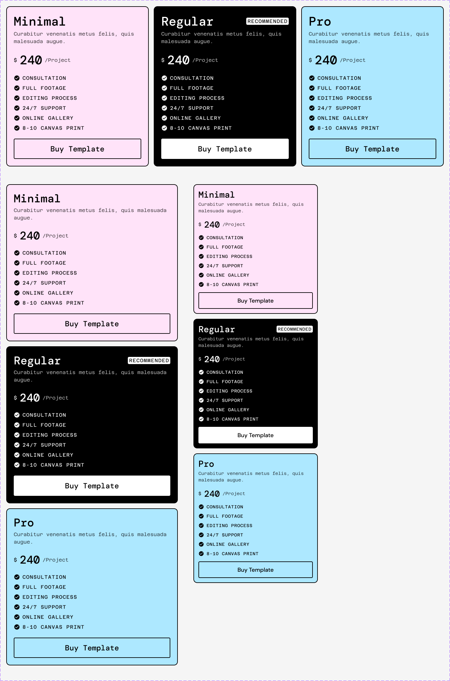
Pricing — package cards arranged for desktop, tablet, and mobile.
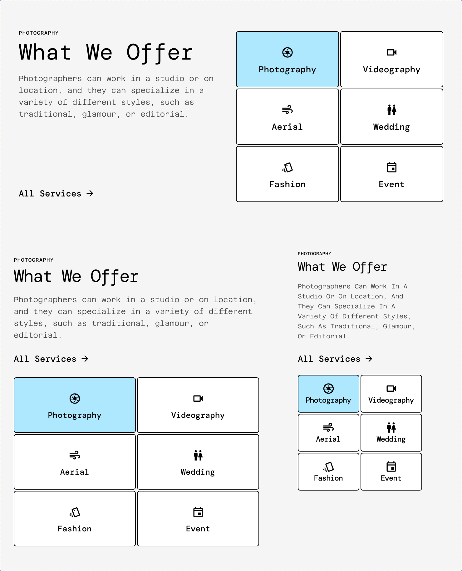
Services — the service section adapted across three device layouts.
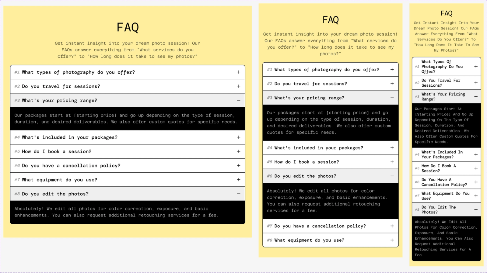
FAQ — responsive question-and-answer sections for desktop, tablet, and mobile.
03 / Let the photograph set the mood
On the live Framer site, street photography replaces the placeholder. A pale blue header and yellow partner strip add energy to the monochrome foundation. In the captured narrow view, the image sits above the headline rather than beside it.
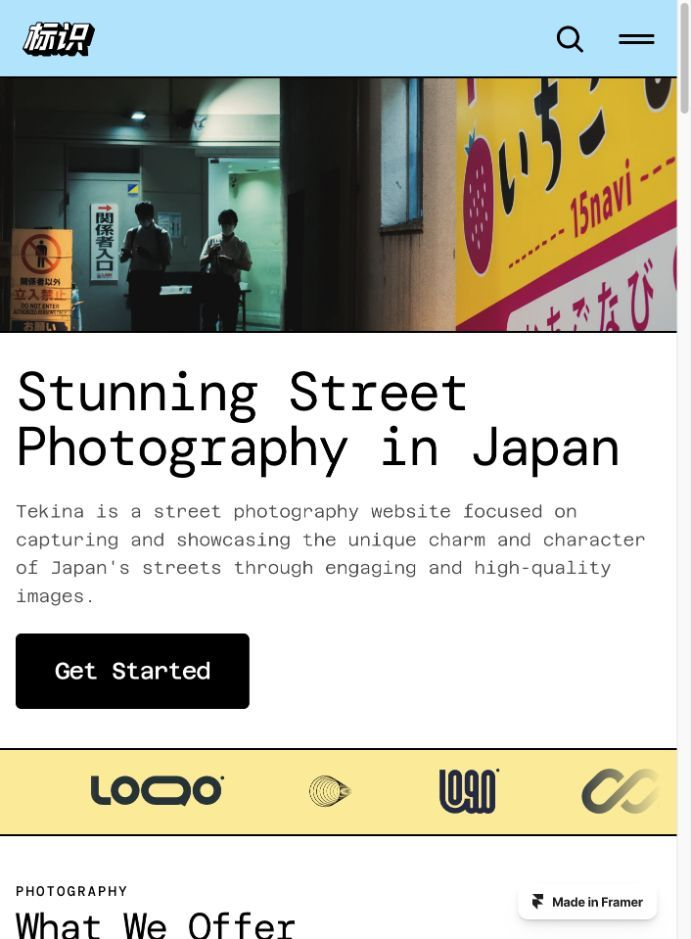
Final result: live Framer homepage at the captured viewport.
The page then moves from atmosphere to explanation: services describe the offer, work examples provide visual evidence, and the FAQ addresses practical questions. That sequence gives the site a role beyond being a gallery.
The result
Tekina’s strongest move is the balance between expressive imagery and repeatable structure. Photography supplies the emotion; typography, borders, and components hold the experience together.
The visible deliverables are a Figma component system and a live Framer template. User-testing results and conversion gains are not documented. A useful next check would be whether new visitors can find a relevant service and understand the primary action, which currently leads to the template checkout.
Process note: these stages reconstruct the design logic from the available artifacts. They do not claim to document the creator’s original timeline, research, or discarded concepts.